
|
Patrick AMAR
. Bioinfo group, LRI, Univ. Paris Sud, CNRS UMR 8623
. Synthetic & Systems Biology group, Sys2diag UMR 9005 CNRS, ALCEDIAG
| Overview |
Pandæsim is an hybrid simulation programme derived from the sub-volumes method used to add coarse-grained spatial localisation capabilities to standard SSA (Stochastic Simulation Algorithm) simulations used for example in the domain of biochemistry. To increase the computing efficiency we also used an original variant of the Gillespie algorithm with tau-leaping, that automatically adapts at each timestep the proportion of randomness vs average-calculation. Our algorithm allows us to easily use either this stochastic variant of SSA, or a deterministic continuous solver, and therefore compare the two methods.
| Download Pandæsim |
|
|
|
|
|
|
| Pandæsim Documentation |
To launch PandæSim from the command line type "pandaesim" (without the quotes) or double click its icon if it is present on the desktop. This on-line documentation can be displayed using the User manual item of the Help menu.
2. Anatomy of the main window
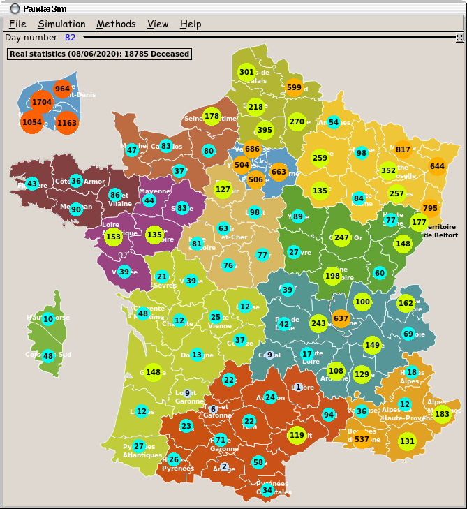
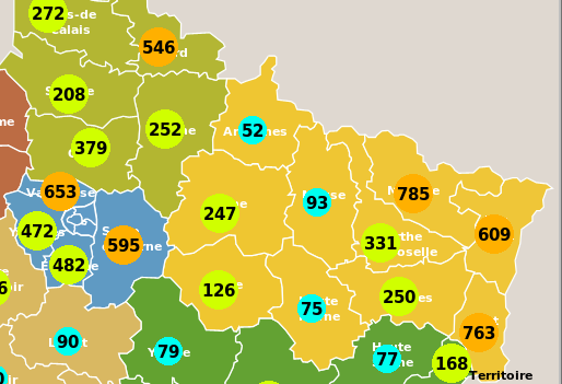
The main window shows a map where each "région" has its own colour
and each "département" is outlined. The results of a simulation are
displayed inside coloured circles for each département. The Paris and
surrounding areas are displayed at a bigger scale on the top left
corner of the window, while the "Corse" région is shown in the left
side of the window, in the Atlantic ocean, because its real location,
in the Mediterranean sea would have been far away in the bottom right
part of the window...
The size and colour of the circles match the number displayed inside:
small and slate grey for a low number to large an red for a high number.
Under the menu bar, there is the Replay slider: when a simulation is done, the sash is automatically placed at the end of the slider. Moving the sash allows the user to go back and forth in time, exploring the trajectory of this simulation. The results displayed on the map and in the curves window are updated accordingly.
A left click on a "département" pops up the corresponding curves window showing the temporal trajectory of the epidemic for this area (the evolution of the epidemic starting from day zero to its end, or to the maximum number of days set in the Parameter dialog box). A left click on any surrounding background area pops up the curves window for the entire country.
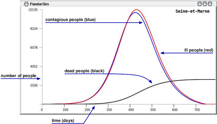
The curves show the number of contagious, ill and dead people computed each hour, but displayed each day.
3. Commands
All the commands can be accessed using the menubar or a keyboard shortcut.

These parameters are gathered in three main groups:
Soft quarantine: no one uses public transportation and neither
meeting nor gathering are allowed.
Full quarantine: everybody stays at home except for one hour
per day to go to non highly populated places.

Two more sliders are shown below the Replay slider; The first one indicates when the quarantine begins, and the second how many days it stands. Any change to a slider triggers a new simulation according to these new parameters.
| Website designed & maintained by Patrick Amar (patrick DOT amar AT lri DOT fr) | 310 hits since July 02, 2020 | |